Just returned from a weekend in Boston, where I witnessed a spirited evening of new-ish music courtesy of Dinosaur Annex, and had a revelatory Chinese meal courtesy of the Peach Farm. I also took lots of photographs for a class I’m starting, and was eagerly importing them when my Aperture library decided to collapse in a heap of corruption. And of course I’d already erased my camera, but hadn’t backed up, so I lost them all. I was especially sorry because there was one of a tub of eels.
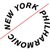
In the excitement over the actual content of New York Phil’s season announcement, I missed that they also unveiled a totally new identity! This makes me indescribably happy. Their old logo and graphics were so generic I actually had to remind myself what they looked like— oh, right:

A swoosh. A musical staff, sure, but still trite, corporate, and completely bland, not to mention poorly executed.

The new logo is the polar opposite. The roles of the graphic and the type are reversed; now, the letterforms themselves create a sense of motion and excitement, and the red line is the anchor (like a baton! I get it). The typography is certainly unconventional (it reminds me of a circular saw blade) but I think that’s kind of what the Phil needs right now— an antidote to years of staid, uninspired administration. (Take a look at some beautiful logo treatments at Pentagram’s blog.)

