The moment I’ve been waiting for for what feels like my whole life has finally arrived: my induction into the Oberlin College Library system. Irving S. Gilmore, better step it up.
Monthly Archives: June 2008
You Haul
There is something I love about moving. I have moved every year for the past five years; even if only across a courtyard, it was cause for excitement. This year we are two people moving across town. The apartment we spent the past year in was cozy and nice enough, but really only the living/working space had much personality. The new place is much bigger, so it feels almost spendthrift even though it’s a fantastic deal; New Haven is completely spoiling my real estate sense of the real world.
What I find exciting is making all my stuff disappear into boxes and then emerge in a different environment, and then adjusting all of the little rituals that make up my life in order to adapt to those differences. Taking out my contacts, boiling pasta, or putting on my shoes takes on new significance by making me stop and think about each step of the action. In my current apartment, for instance, I adopted a completely new and revolutionary concept of face-washing in the morning— over the bathtub, because the sink is too small to contain all the drips and splashes. It looks ridiculous, but I can be as messy as I want.
I also like the moment of the last look around an empty room, which I always find quite sad, but so loaded with anticipation— not a feeling I’ve experienced in any other situation.
Next week is moving week, and it’s also WWDC! So ready for an iPhone nano. My dad is there and will be sending back live reports.
Set Change
Every year I go through a cycle of redesigning my website, liking the design a lot, gradually liking it less and less, and then redesigning again. This has pretty much been happening since 2001, so I might as well instate it as an annual tradition. I haven’t kept very good records of the old designs, which is a pity, because some of them were really bad and hilarious. Here is what the home page looked like in 2001:

As you can see, I have gotten over the rounded rectangles thing, but I still like gray.
The 2008 redesign is more of a collection of refinements than a real overhaul. The fonts are different; I decided that Meta was looking too corporate (not that Helvetica isn’t the epitome of corporate, but it can also be a lot of other different things). The page headings are now in Gotham and Hoefler text (hooray H&FJ!). As soon as I started working with Gotham I began to notice it absolutely everywhere, from Obama to Martha Stewart to Banana Republic, so I guess I’m still pretty much a corporate poseur. But it is nonetheless a great font.
Some more changes have taken place behind the scenes, as I’ve switched from GoLive to Dreamweaver. I don’t like either program; Dreamweaver is finicky (though perhaps in fewer respects than GoLive) but I still think GoLive has a better user interface. Dreamweaver feels like a Windows app, with features thrown together in a bunch of palettes (all of which operate in slightly different ways) without much regard to organization or visual hierarchy. The WYSIWYG compositing tools are better and more reliable than Golive’s, though, which is really what counts for me since I don’t know how to program.
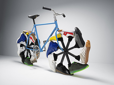
I will be making more incremental improvements over the summer. In the meantime, I leave you with this picture, which can be magnified courtesy of Cabel Sasser’s pretty sweet FancyZoom:
